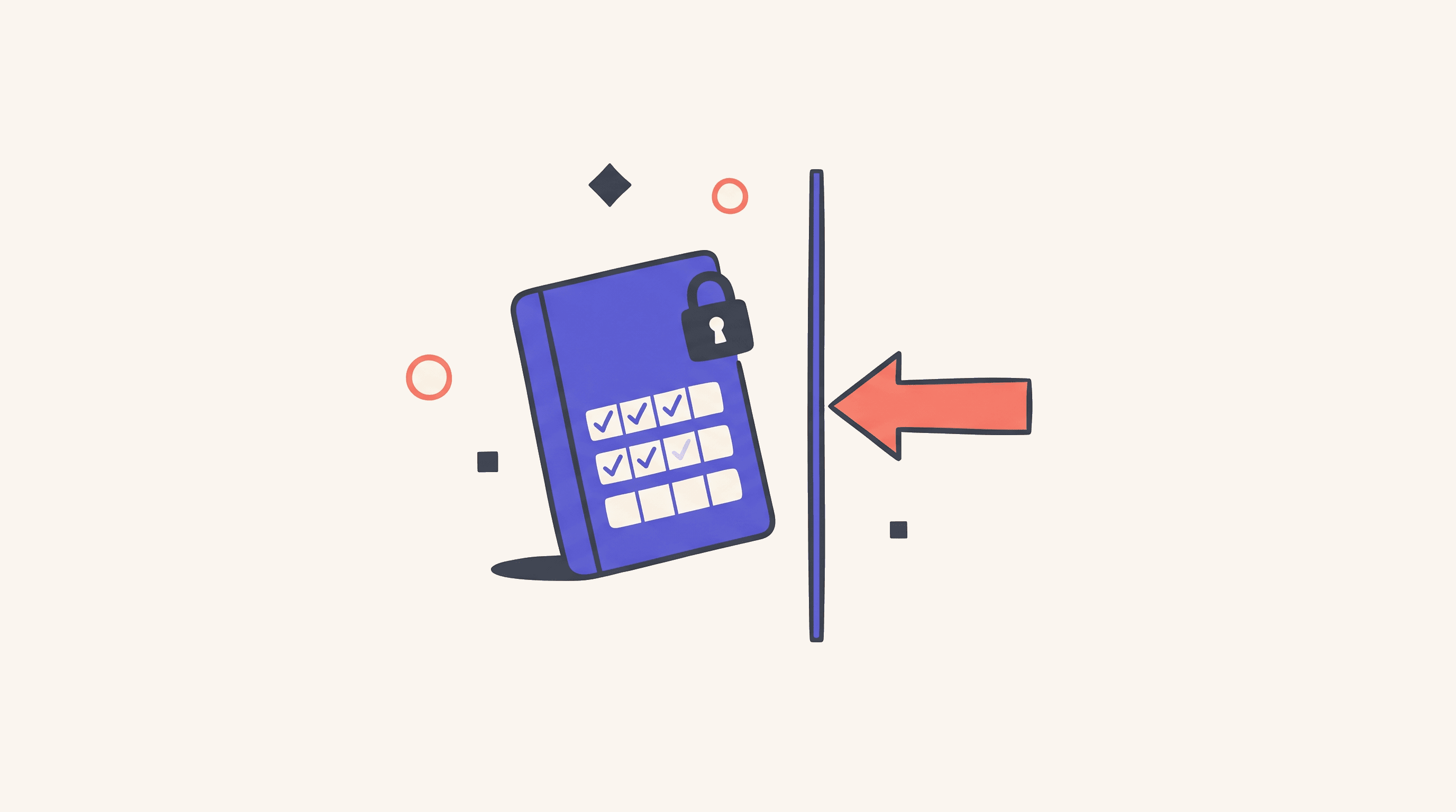
When Generation Replaces Figma
Nine design jobs decide which trips through Figma a prompt-to-prototype platform replaces, and which ones the brand and design system keep.
TL;DR
AI design generation isn't one tool. Nine different design jobs sit underneath the design loop, and only some of them actually leave Figma for a prompt-to-prototype platform like v0, Lovable, Bolt, Subframe, Figma Make, or Replit Agent. Most teams that try to swap Figma for a generator wholesale watch the brand drift three different ways inside a quarter. Most teams that block the generators entirely burn three weeks of designer time on a prototype that only needed to answer one research question. Both teams are paying real money for the same thing: treating this as a tool decision instead of a job decision.
The pattern that works: generation earns the slot when the deliverable is a quick thing the team isn't going to maintain. Figma and the design system keep the slot when the deliverable is the brand, the system itself, or a component that lives for years. Marketing pages, engineering scaffolds, internal tools, and user-test prototypes are where generation actually replaces a trip through Figma. Component design, production-system maintenance, and customer-facing product UI stay split between Figma and the design system, with the generator constrained by both.
A starting stack pairs Figma with one prompt-to-prototype platform that fits the team's code:
- v0 for React and Next.js teams shipping marketing pages and handoff scaffolds against their own component library
- Lovable for full-stack MVPs that need authentication, storage, and a deploy target in one place
- Bolt for JavaScript-heavy teams that want fast generation in the browser
- Subframe for React and Tailwind teams that want one component model serving as the source of truth for both design and code
- Figma Make for prototypes that start from work already living in Figma
- Replit Agent for internal tools where the data, deployment, and visual editing all sit in one workspace
Monthly cost runs from free tiers up to roughly $15 to $90 per Figma seat, plus $20 to $100 per prompt-to-prototype seat, plus credits past the free allowance. The number worth tracking isn't the seat price. It's the cost per finished surface, with designer time, engineering rework, and brand-and-accessibility review counted in.
Routing the job is the team's job, not the platform's. A generator can render a settings page. It can't tell the team whether to ship one.
Three Teams That Misrouted the Design Job
A 30-seat consumer SaaS company replaced its landing-page workflow with Lovable. The page that shipped looked clean and persuasive in the launch review, and the founder told the board the design loop had gone from two weeks to two days. The page also contained raw color values sitting next to real brand tokens, a button that almost matched the system button but not quite, and heading order that followed visual scale instead of document structure. The modal had a visible close icon but no clear name for a screen reader to read out. The form worked with a mouse and failed the team's keyboard path. Two weeks after launch, design and engineering were still unwinding decisions that had been invisible in the launch review. The mistake wasn't using generation. It was treating an early draft as a finished piece of product. Lovable's design-system scanner exists because this is what unconstrained generation usually produces, not the exception. Call it the clean-looking launch.
A product team at a Series B startup found that v0 and Bolt could turn a one-paragraph brief into a working internal-tool prototype before lunch, and within a quarter the team was producing 30 prototypes a sprint. The PMs stopped maintaining the same flows in Figma because the live code felt more convincing in stakeholder review and cheaper to update. Six months later, nobody could answer simple system questions. Which table pattern was the standard? Why did one filter clear immediately while another waited for an Apply button? Which prototype contained the approved empty state? The prototypes still ran. The thinking behind them had scattered across prompts, project histories, branches, and people's heads. Bolt supports project downloads and Git workflows, but the prompt history and the decision record still need to be saved on purpose, and the team had never built the habit. Call it the prototype factory.
A 60-person design-system team at an enterprise SaaS company watched the first two failures play out around it and blocked all generation tooling on the product side. A product designer then spent three weeks hand-building a high-fidelity flow whose only job was to answer one research question in five user sessions. The test invalidated the concept. Most of the work got thrown away. The final component shipped weeks later, hand-built from the existing system anyway. The team had protected the production work by taxing the exploration work. Vercel's Code and Theory case study reports a 75 percent cut in time-to-prototype after that team replaced wireframes and requirements documents with live v0 prototypes. The number is vendor-reported, but the protected-system team was paying the opposite cost without measuring it. Call it the protected system.
Three teams, three different mistakes, one shared category. They treated this as a tool-selection decision instead of a job-routing decision, and the work paid the difference. None of the failures needed a bad tool. The platforms were doing exactly what they were sold to do. The teams asked them to do the wrong job.
The lifecycle anchor is the May 2026 accessibility-repair study by Oyelayo and colleagues. Across the files in the study, LLM repairs cut detected violations from 3.98 per file to 1.7, fully resolved fewer than 26 percent of the cases, and introduced structural changes in about 30 percent. A polished preview shows that a direction can be rendered. It doesn't show that the interface is ready for real customers.
Action Plan
Days 1 to 7: Classify the jobs, not the platforms. Pull the design work in the team's active sprint and tag each item against the nine jobs in this Dossier. Record the deliverable (file or live URL), the consumer (user, stakeholder, customer), whether the result is throwaway or has to stick around, and the surface the work currently lives on. Resist platform changes this week. The week-one output is a one-page table that shows which jobs are throwaway and which are long-lived, with the current surface in one column and the natural target surface in the next. The first surprise is usually that the team has been running long-lived work on a throwaway surface, or paying for throwaway exploration in the surface built for long-lived work.
Days 8 to 14: Connect the design system to one candidate platform. Pick one prompt-to-prototype platform that fits the team's code. Wire it up to the team's tokens, component package, Storybook, repository rules, and accessibility requirements. The Friday output is a single generated surface that passes a token audit, a component check, and an automated accessibility scan against the team's normal standards. If the platform can't read the design system, the routing decision is already made and the rest of the pilot is exploration only.
Days 15 to 30: Run three real surfaces and measure the loop. Build one throwaway exploration (six directions for a real decision the team is making), one production component (a medium-complexity component with real states), and one marketing page (a real campaign with real copy). Score each surface by time to first useful draft, time to a second draft the team accepted, token violations, duplicate primitives, automated and manual accessibility defects, brand-review defects, and engineering rework hours. Only promote the platform to the team's standard stack after the loop wins on cost per finished surface, not on cost per generation.
The Nine Jobs and the Surface That Earns Each One
Each sub-case below names the job, the surface that earns the slot, what ships clean, where the ceiling sits, the rule that decides whether generation belongs, and the Friday action. A short table of production examples closes each one.
Discovery and Direction Finding
The work is divergence. Ten page structures for the same brief, three onboarding models the team hasn't seen yet, five interpretations of what the product might be. The designer isn't choosing pixels; the designer is widening the set of ideas before convergence makes each new direction expensive.
The slot belongs to a prompt-to-prototype platform with low setup cost and a fast iteration loop. UX Pilot is the default because it can start from a prompt, an image, a PDF, or a URL, generate screens and flows, refine them conversationally, and continue into Figma or code. v0 and Bolt also serve well when the team wants the divergence to land as live, clickable pages.
What ships clean:
- A contact sheet of six or more structurally different directions for the same brief
- Realistic placeholder content so reviewers react to the idea, not the lorem ipsum
- A one-line hypothesis behind each direction (what product assumption it tests)
- A decision record naming the direction chosen and the assumptions the team is now committed to
The ceiling appears when the team starts grading the generator's visual taste instead of the product idea. Familiar SaaS layouts come back polished enough to feel inevitable, and the team picks one because it looks right instead of because it tests anything. The named failure mode is the polished default: a generation loop that lands the same layout every time because the model has seen that layout ten thousand times and the prompt didn't push it anywhere else.
Generation earns the slot when the output sparks comparison instead of asking for approval, and when the team treats the generated files as decision aids that won't survive the week.
If you start this week, write one brief, force six structurally different answers, ban color and brand language from the first pass, and keep only the direction and the decision record. The other five generations die on Friday.
Examples of what this looks like in production:
| Brief | What divergence looks like | Default platform |
|---|---|---|
| New onboarding for a B2B SaaS signup | Six flows: progressive disclosure, guided checklist, AI-led setup, sandbox-first, team-invite-first, role-driven | UX Pilot |
| Pricing page for a self-serve product | Six layouts: comparison table, anchored tier, calculator, FAQ-first, social-proof-led, single-CTA | v0 |
| Settings information architecture for a mature product | Six structures: profile-first, workspace-first, billing-prominent, integrations-prominent, search-driven, sidebar-collapsed | UX Pilot or v0 |
Wireframes and Information Architecture
The work is hierarchy, sequence, navigation, and content priority. A wireframe is useful because it lets the team argue about structure before surface craft turns every criticism into a redesign.
The slot belongs to a generator that produces editable, visibly provisional output and continues into the team's normal critique workflow. UX Pilot inside Figma is the default because the Figma file is where the team already runs critique, and the wireframe needs to land where stakeholders can comment without learning a new tool.
What ships clean:
- An editable flow with named states, plausible content lengths, and the navigation paths called out
- Annotations for the questions the team hasn't resolved yet (what happens on error, what happens on empty, what the default state is)
- Mobile and desktop versions of the same flow, generated against the same prompt
- A real-content pass before review, with the placeholder copy replaced by language the team actually plans to ship
The ceiling appears when a layout the team meant as a sketch becomes the spec by accident. Generated wireframes carry component choices, platform conventions, and desktop assumptions that the team never explicitly approved. Once stakeholders react to the surface as if it had been signed off, the wireframe is making decisions the team didn't realize it was making. The named failure mode is the silent spec: a wireframe that looks rough but quietly locked in a tab pattern, a modal pattern, and a sidebar pattern nobody meant to commit to.
Generation earns the slot when the result stays editable in the team's critique tool and when the team treats the wireframe as a thinking aid, not a spec that gets shipped to engineering.
If you start this week, generate the same task at mobile and desktop widths, swap placeholder copy for real labels before critique, mark every unresolved logic question directly on the Figma canvas, and check whether the tool can rearrange hierarchy without touching the product model underneath. If it can't do that cleanly, stop regenerating and edit by hand.
Examples of what this looks like in production:
| Flow | What the wireframe must show | Default platform |
|---|---|---|
| Checkout for a multi-product cart | Step count, error recovery, address-validation pattern, payment branching | UX Pilot in Figma |
| Search and filter on a content catalog | Filter persistence, empty state, no-results pattern, mobile collapse | UX Pilot in Figma |
| Approval queue for an internal tool | Bulk action, single-action, escalation path, audit trail visibility | UX Pilot or v0 |
Visual Design and Styling
The work is brand: type, color, spacing, imagery, motion, and composition. This is where a system becomes recognizable, and where small exceptions become expensive to clean up later.
The slot belongs to Figma, assisted by Figma Make when the team needs the visual direction to come alive in a clickable surface. Figma variables, libraries, and Make kits give this phase the best chance of staying attached to real design decisions. v0 and Magic Patterns help when the team needs the same visual direction stress-tested across multiple page types fast.
What ships clean:
- A chosen visual direction built on the team's existing variables, library components, type rules, motion guidelines, and real content
- Three or more uses of the same system applied to different pages, not three unrelated styles, so the team can see whether the system holds up at scale
- A variable check and a component check before review, with any one-off value flagged for an explicit reason or removal
- An archive of the directions the team didn't pick, with a one-sentence note explaining why each one lost
The ceiling appears when tokens drift and the brand starts to flatten out. A generator can match a screenshot while missing the logic that makes the system extensible. It can also overfit to a single prompt by adding a one-off gradient or a one-off spacing value that looks excellent once and has no place in the rest of the system. The named failure mode is the parallel system: a folder of generated visuals that compete with the team's library instead of extending it.
Generation earns the slot here only when it applies a visual language the team has already defined, or generates throwaway directions for early exploration. It doesn't earn the slot as the author of the language itself. The brand belongs to the team, and the system is what lets the brand show up consistently everywhere it has to.
If you start this week, feed tokens and components to the platform before any mood adjectives, generate three uses of the same system rather than three unrelated styles, and run a variable check and a component check before review. Reject anything with a one-off value the team can't defend.
Examples of what this looks like in production:
| Direction | What survives review | Default platform |
|---|---|---|
| Marketing-site refresh against new brand tokens | Three page types using only library components, real copy, real photography | Figma plus Figma Make |
| Product surface restyling for a major release | Five core flows with token-only color, type, and spacing changes | Figma |
| Campaign microsite for a launch | One page with new motion, audited for token and component compliance | Figma Make or v0 |
Component Design
The work is making a reusable component that the team and the rest of the product will depend on. A production component carries states, content rules, semantics, API decisions, documentation, tests, and upgrade consequences. Its visual appearance is the smallest part of what it has to get right.
The slot belongs to Subframe for React and Tailwind teams that accept its component model as the source of truth, and to Figma plus Storybook for everyone else. Subframe is the only tool in the category that treats the team's design system as the rule rather than as one input the model can override when the prompt pushes it to. Its Radix-backed primitives give the generated output a credible accessibility starting point.
What ships clean:
- A reviewed component in the team's actual repository, wired to tokens, shown in Storybook, tested for states and interactions, and owned by a named maintainer
- A written API the team is willing to defend at the next major version
- Accessibility evidence: keyboard navigation, focus management, ARIA roles, contrast against system tokens, and a manual review by a designer or specialist
- Generated documentation, test scaffolds, and Storybook stories that the maintainer signed off on before merge
The ceiling appears the moment generation creates a second button, a second input, a second dialog, a second table, or a second navigation pattern that does roughly the same job. Accessible primitives raise the baseline, but they don't decide content, focus order across a page, responsive behavior, or whether the whole interaction makes sense to a real user. The named failure mode is the duplicate primitive: a generated component that looks right and quietly competes with the library entry the team has been carefully maintaining for a year.
Generation earns the slot here only on three conditions. It uses or extends the team's existing components inside the real code repository. The change gets reviewed against the hand-built baseline by total review and rework time, not by how fast the first render looked. One-off lookalikes get rejected on sight.
If you start this week, choose one medium-complexity component the team is about to update, give the platform the current API, tokens, Storybook stories, and accessibility requirements, and compare the generated change against the hand-built baseline by time to approved merge.
Examples of what this looks like in production:
| Component | What the generated change must do | Default platform |
|---|---|---|
| Data table with sort, filter, pagination, row actions | Match library API, preserve keyboard support, ship Storybook stories | Subframe |
| Multi-step form with validation and recovery | Reuse the input, button, and field-error primitives; ship a11y review notes | Subframe or Figma plus Storybook |
| Notification component with severity and action variants | Use existing tokens, support reduced-motion, document escalation pattern | Figma plus Storybook |
Prototypes for User Testing
The work is building enough of the real thing for users to react to. Fidelity is a means, not the goal. The prototype can look production-ready and still be a throwaway.
The slot belongs to Figma Make because designers can start from work already in Figma, add behavior, publish a testable URL, and keep critique close to the design file. Bolt and Lovable take the slot when the prototype needs realistic backend behavior the Figma context can't fake.
What ships clean:
- A live path with realistic data, the states the study script needs, a stable reset, and analytics or session replay the researcher can review
- A research question written down before the prompt, so the prototype's scope is set by what the study actually needs
- Just enough instrumentation to support observation, without the prototype turning into a half-built product
- A decision after the sessions: archive the findings, archive the prototype, or move the prototype through the full production gate
The ceiling appears when the prototype's realism starts expanding the study rather than serving it. Authentication flows, backend logic, loading states, and edge cases can swallow days of work without moving the research answer one inch. A second ceiling appears when a research prototype gets promoted into the live product later, on the grounds that it already exists and looks finished. The named failure mode is the prototype that ships: a research-only build picks up a URL, accumulates real users, and ends up in the product because nobody scheduled the rebuild.
Generation earns the slot here when the study script comes first, when only the states participants can reach get built, and when the team writes down ahead of time whether the prototype is going to be archived or rebuilt through the production gate.
If you start this week, write the research question before the prompt, build only the states participants can reach, add a reset button, and archive findings and decisions after the study. Either delete the prototype or move it through the full production gate.
Examples of what this looks like in production:
| Study | What the prototype must do | Default platform |
|---|---|---|
| Test a new onboarding flow with five participants | Live path, realistic data, stable reset, mobile responsive | Figma Make |
| Validate a billing-upgrade flow before engineering invests | Working state transitions, fake payment confirmation | Figma Make or Lovable |
| Test a workflow change with internal users | Authenticated path, realistic notifications, audit trail | Bolt or Lovable |
Internal Tools and Operational Prototypes
The work is a small, data-connected app for a small audience. Triage queues, approval flows, inventory views, content moderation, campaign operations. These surfaces have real users and real consequences, and usually less brand and reuse pressure than customer-facing product UI.
The slot belongs to Replit Agent because the code, the data, the deploy, the visual editing, the checkpoints, and the running operations all sit in one workspace, and the team can iterate without juggling multiple tools. Bolt and Lovable take the slot when the team prefers their JavaScript or managed-cloud workflows.
What ships clean:
- A working app with access controls, repository ownership, backups, logging, data retention rules, and a written hardening or retirement date
- A named owner who carries the support pager when the tool breaks at 4pm on a Friday
- The same security, keyboard, and recovery checks the team runs on a purchased operations tool, not a lower bar because "it's internal"
- A retirement plan that names what happens when the team replaces the tool, shuts it down, or moves it into the main product stack
The ceiling appears when "internal" becomes permission to skip product discipline. Internal tools handle sensitive data, make irreversible decisions, and become business-critical without warning. A platform's breadth of features isn't proof of output quality, and a nice-looking theme can hide drift in components, security, data handling, or how the tool relates to the production system. The named failure mode is the ownerless tool: an internal app that runs the business until the day it doesn't, and the team has to figure out how it worked under a deadline.
Generation earns the slot here when the tool has a small audience, a named owner, and a plan for what happens when it gets replaced. It doesn't earn the slot when the team thinks "internal" is shorthand for "low standards."
If you start this week, pick one tool with fewer than 25 users, write down the data owner, the failure consequence, the access rules, and the retirement plan before generating, and run the same security and recovery checks the team would run on any purchased product.
Examples of what this looks like in production:
| Tool | Audience | Default platform |
|---|---|---|
| Support triage and assignment dashboard | 12 support agents | Replit Agent |
| Vendor-invoice approval flow | 6 finance and operations users | Lovable |
| Inventory exception queue with bulk actions | 20 warehouse operators | Bolt or Replit Agent |
Engineering Handoff
The work is converting a designed surface into production code engineering will own. Handoff now has two routes. Generated code can be a scaffold that gets the implementation started, or it can be the version that ships. Treating those two as the same thing is where most of the debt around prompt-to-code starts.
The slot belongs to v0 for React and Next.js teams as the scaffold default, because it can take Figma context, read the team's component registry, create a branch, write commits, and open a pull request without pushing directly to main. The repository is where the code lives, not the platform's workspace.
What ships clean:
- A branch that uses the team's approved dependencies, components, tokens, tests, naming, and architecture
- A pull request engineering can review like any other, where the diff is the handoff rather than a link to someone else's workspace
- A record of what the engineer kept, rewrote, and removed, so the team can measure scaffold quality over time
- The same code-review gate the team applies to hand-built changes, with no special pass for "the AI wrote it"
The ceiling appears when the generated branch gets treated as correct by default. A clean screenshot can mask duplicate components, weak semantics, dependencies the project doesn't need, fragile responsive behavior, and code nobody on the team can explain. The same review gate that applies to hand-built code has to apply here too. The named failure mode is the assumed-correct PR: a generated branch that gets merged because a careful review would take longer than rewriting from scratch.
Generation earns the slot as scaffold when engineering can review a normal branch, swap out generated assumptions, and keep only what meets the team's standards. It earns the slot as the version that ships only on throwaway or low-reuse surfaces, like marketing pages or internal tools, where the team has agreed in writing to own the maintenance.
If you start this week, connect a real repository and a real component registry to one prompt-to-prototype platform, generate one bounded page, and require engineering to record what it kept, rewrote, and removed. Measure time from first generation to approved merge.
Examples of what this looks like in production:
| Surface | What the scaffold must include | Default platform |
|---|---|---|
| Customer-facing settings page with tabs | Approved layout, real tokens, working tab state, accessibility evidence | v0 |
| New marketing page tied into the existing site | Real components, real copy, responsive review, performance budget | v0 |
| Internal admin page for a new feature | Auth wiring, real data table, tested empty and error states | v0 or Bolt |
Production-Component Maintenance
The work is long-term care of the design system. Versioning, deprecation, accessibility audits, regression coverage, documentation, and getting teams to actually adopt the new version. This phase exists to keep the surfaces the team has already shipped consistent with each other.
The slot belongs to Storybook plus the team's token pipeline plus the team's normal design-system review process. Generation can draft migration notes, tests, stories, usage examples, and codemods, but the system itself stays in the team's repository under the team's review.
What ships clean:
- A versioned component or token change with reviewed API, updated documentation, visual and interaction tests, accessibility evidence, and an upgrade path for teams already using the old version
- A release note the team's product designers can read and act on
- Codemod or migration scripts where the change breaks an existing API, so the upgrade is mechanical rather than archaeological
- Documentation that stays attached to the implementation, not a wiki page that drifts after the first release
The ceiling appears when maintenance gets treated as regenerating from scratch. Recreating a component throws away why the variants exist in the first place, which other product teams depend on the old behavior, and which constraints the team learned through support and research over the past year. The named failure mode is regeneration as maintenance: a tidied-up component that looks better in isolation and quietly removes the patterns three other product teams have been depending on.
Generation doesn't earn the primary slot here. It earns supporting work inside the team's system, and only after a maintainer has signed off on the semantics, the API, the upgrade plan, and the release.
If you start this week, expose the system to the platform through Storybook, token JSON, component docs, and repository rules. Let the platform propose a change. Require a maintainer to sign off on semantics, API, upgrade plan, and release before anything merges.
Examples of what this looks like in production:
| Maintenance task | What the platform handles, what the human handles | Default surface |
|---|---|---|
| Major version of a button component | Platform drafts codemod and migration notes; maintainer approves API and release | Storybook plus repository |
| Accessibility audit across the form library | Platform proposes ARIA and focus-order changes; designer and a11y specialist review each one | Storybook plus repository |
| Token consolidation across two brand themes | Platform drafts token map and migration script; design-system team approves merge plan | Token pipeline plus Storybook |
Marketing and Landing Surfaces
The work is persuasion under brand rules. Marketing pages reuse fewer components than core product UI, carry more visual novelty, and have measurable conversion goals. They are generation's strongest production case and one of its most deceptive.
The slot belongs to v0 for React and Next.js teams. Visual editing, Figma input, custom registries, GitHub, and deployment hosting form a fast route from a direction to code the team can review. When the team wants several branded directions to choose from before settling on one, Magic Patterns has the design-led edge. When the page has to handle forms with backend behavior, authentication, or managed storage, Lovable carries more of the weight.
What ships clean:
- Portable page code in the production repository, using the team's approved tokens and shared components, with real copy, responsive review, analytics, metadata, performance checks, and a completed accessibility audit
- A brand-review pass done in the browser at multiple breakpoints, not on a screenshot in a deck
- A maintenance plan that names who owns the page after launch and when it gets refreshed or retired
- Conversion instrumentation that lets the team retire the page if it underperforms, instead of accumulating dead pages
The ceiling appears when the brand starts to fracture in small ways. A new gradient, a new icon family, a new spacing rhythm, or a new animation feels harmless on a single campaign. Repeated exceptions add up to a parallel brand system. Conversion polish also hides low-contrast type, motion that ignores reduced-motion preferences, inaccessible carousels, and weak focus states. The named failure mode is the campaign that became the brand: a generated page that looked too good to refuse and quietly reset the team's visual baseline.
Generation earns the slot here only with audit. A page can be built in isolation, generated, reviewed against the team's standards, and shipped on a faster loop than the old marketing-design process allowed. It doesn't earn the slot as an excuse to skip the review.
If you start this week, generate one real campaign page with real content and review it at 320, 768, 1024, and 1440 pixels. Then run the audit stack: token diff, component inventory, automated accessibility scan, keyboard pass, screen-reader spot check, reduced-motion review, and performance test. Have brand review the page in the browser rather than in screenshots.
Examples of what this looks like in production:
| Surface | Review gates before launch | Default platform |
|---|---|---|
| Product-launch hero and feature pages | Brand, accessibility, performance, analytics, mobile breakpoints | v0 |
| Multi-variant campaign landing pages | Brand consistency across variants, conversion instrumentation | Magic Patterns or v0 |
| Lead-capture page with managed form and auth | Brand, accessibility, form-error handling, data routing | Lovable |
What the Human Designer Owns Regardless of Tool
The designer owns the throwaway-versus-production decision. A platform can't make it because a piece of work can switch from throwaway to production midway through. A research prototype gets promoted because it looks finished. A marketing page gets ignored because it looks rough. Both are the same mistake caught from opposite directions.
The designer owns the brand itself. A generator can follow a scale once the team has written one down. It can't decide whether that scale expresses the right character across the product, whether the motion feels confident or jittery in actual use, or whether the type holds up at the smallest sizes the team supports.
The designer owns content strategy. Generated copy is useful filler and dangerous as the final word. Naming, sequencing, disclosure, error recovery, and the trust the user builds up across a whole session are product decisions, not things a generator chooses for you.
The designer owns the accessibility work done with disabled users and the team's accessibility specialists. A generator can hand back semantic HTML, Radix primitives, or a clean automated scan. None of those prove the experience is understandable, operable, or robust when a real person uses it under real conditions.
The designer owns the team's memory of why decisions were made. A prompt history isn't a rationale. The reasons behind a decision have to land in research summaries, the system docs, the component APIs themselves, or product records that someone will actually open later, not in a Discord thread that nobody scrolls back through in nine months.
The designer owns the judgment call that says this prototype is good enough to put in front of five participants, and this one isn't good enough to put in front of five thousand customers. A platform can't draw that line, because it doesn't know what the team is selling, who is paying for it, or what happens when the experience falls short.
A team that hands those six decisions to a platform has handed over design itself. Six months later the product looks like something the platform built, not something the team did.
Cost Calculus and Coexistence
The cheapest line item is not the cheapest stack. A team paying $0 in seat fees while burning 40 engineering hours per shipped surface is paying more than a team running v0 Team and shipping cleanly. The math below assumes a team of five to fifteen designers and engineers shipping somewhere between four and twenty surfaces per month; enterprise programs push every number up.
Pricing sampled June 22, 2026:
| Platform | Entry tier | Mid tier | Enterprise |
|---|---|---|---|
| Figma | Starter free | $16 per user per month (Professional Full) | $55 to $90 per user per month (Organization Full, Enterprise Full) |
| v0 | Free | $30 per user per month (Team) | $100 per user per month (Business), custom (Enterprise) |
| Lovable | Free | $25 per month (Pro), $50 per month (Business) | Custom (Enterprise) |
| Bolt | Free | $25 per month (Pro), $30 per member per month (Teams) | Custom (Enterprise) |
| Subframe | Free | $29 per editor per month (Pro) | Custom |
| Figma Make | Included with Figma Pro and above | Included with Pro and above | Included with Organization and Enterprise |
| Replit Agent | Free (Starter) | $25 per month (Core), $100 per month (Pro) | Custom |
| Magic Patterns | $20 per month (Starter) | $100 per month (Business) | Custom |
| UX Pilot | Free | from about $14 per month (annual) | Custom |
Then count what the seat price hides:
- Credit and token meters past the free allowance, which dominate the bill when the team runs heavy generation loops
- Designer time spent prompting, reviewing, and reconciling generated output against the team's system
- Engineering rework hours turning a generated branch into a mergeable change the team is willing to maintain
- Accessibility review time, especially on marketing and customer-facing surfaces
- Brand-review hours catching small drifts before they add up to a parallel brand
- Hosting, database, and runtime costs when the platform's deploy target is also the team's production target
- The cost of being wrong about which surface was throwaway, which one had to last, and how much rebuild work the team committed to without realizing it
Five coexistence patterns capture most teams:
- Figma plus one generation platform: best for small teams shipping product UI through a stable design system. Pick Figma Professional plus v0 Team or Subframe Pro and route every job to one of the two surfaces based on the routing table. Spend lands at $45 to $75 per user per month plus credits.
- Figma plus a generation platform plus a research-prototype platform: best for product teams that test heavily with users. Add Figma Make on top of the base stack so research prototypes start from work already in Figma. Spend lands at $60 to $90 per user per month plus credits.
- Figma plus a marketing-page generator plus repository ownership: best for growth teams that ship campaigns weekly. Pair Figma with v0 or Magic Patterns and keep the page code in the team's main repository, reviewed against the design system. Spend lands at $45 to $80 per user per month plus credits.
- Figma plus Subframe as the shared UI source: best for React and Tailwind teams willing to make one component model the source of truth across design and code. Subframe takes over some of the component work that used to live only in Figma, not the visual-design or research work. Spend lands at $45 per user per month plus the team's rollout time.
- Figma plus Replit, Bolt, or Lovable for small internal tools: best for teams that need operations apps for a small, named audience. Keep customer-facing product UI in the main stack. Spend lands at $40 to $130 per user per month depending on which full-stack platform the team picks.
Two platforms earn their seats when one carries the design system and the other carries the generation surface, and the team has a routing table that decides which job goes where. They don't earn their seats when the second platform exists because the team never picked one and "more tools" felt safer than committing. A second platform can't decide what the brand is. It can only render two competing versions of it on the same Tuesday.
Pitfalls and Anti-Patterns
Shipping a Generated Page Without a Brand Audit
Auditing only the hero while exceptions survive in the forms, error states, responsive breakpoints, and motion. A page can be 90 percent on-brand and 10 percent quietly off, and the 10 percent is what the brand audit in six months is going to flag. The fix is a full audit at every breakpoint the team supports, done in the browser and not in a deck.
Replacing the Design System With Generated Components
A library is valuable because one decision flows out to every product that uses it. A folder of locally generated lookalikes has the opposite property: every one of them is an exception waiting to break the next global change. The fix is a hard rule that generated components either use the team's existing primitives or get rejected.
Using Generation for the Core Components
Buttons, inputs, dialogs, menus, navigation, and tables should come from the design system unless the work is explicitly a contribution to the system itself. Generating a "better" button on a campaign page creates a second version of the button that the next maintainer doesn't know about. The fix is a lint rule, a code-review checklist, or a Storybook gate that catches one-off versions of components that already exist.
Evaluating Platforms on the First Demo
The first render is where every platform looks best. The team should evaluate the second iteration, the fifth iteration, and the repair loop. Try changing one element without changing the surrounding behavior, applying a token globally, and swapping a one-off lookalike for the approved component. Then accept a real engineering review. How well a platform repairs matters more than how impressively it invents.
Accepting Accessibility Defaults as Certification
Primitive libraries, semantic HTML, and automated scans lower the risk. They don't certify the product. A team that treats a clean automated scan as proof the product is accessible is going to learn the difference the first time a customer using a screen reader files a support ticket. The fix is to keep manual accessibility review on every customer-facing surface, generated or not.
Bypassing Design-System Review for Generated Work
Hand-built work goes through the design-system review. Generated work skips it because it shipped faster. The faster lane becomes the least accountable one, and the design system erodes at the rate the team is generating exceptions to it. The fix is one rule: every change goes through the same review, regardless of who or what produced it.
Treating Prototype Maintenance as Free
A prototype that lives for months needs a repository, an owner, a decision log, and a connection to the production design system. Without those, the team is digging through old prompts every time the prototype needs a change. The fix is a written decision at the end of every study: archive the prototype, accept the maintenance cost, or rebuild through the production gate.
Counting Only the Seat Price
Credits, tokens, hosting, runtime AI, databases, and rework all belong in the cost-per-finished-surface number. A cheap generation can be an expensive integration. The fix is to track the full loop, not just the line item.
What to Validate Before Paying for the Stack
The pilot below tests the routing program against a real design loop, not a sales demo. It produces measurable pass-fail gates and a buy or pass decision the team can defend.
Before day one. Pick three surfaces that cover the range: a throwaway exploration, a real production component, and a real marketing page. Connect Figma variables, token JSON, the component package, Storybook, repository rules, and test commands to the candidate platform. Decide which platform is the candidate and which competing platform sits behind it as a credible alternative. Write down the brand and accessibility standards the team will use to grade the output.
Week one: build the three surfaces. Run the throwaway exploration in two candidate platforms and pick the one with stronger divergence and a faster second iteration. Build the production component against the team's component model, with the team's tokens, and score it through the normal design-system audit. For the marketing page, work in the team's actual repository against real copy, real imagery, and the team's real performance budget.
Week two: cancel-test and decide. Simulate a cancellation. Export code, assets, prompt history, and any deploy files. Rebuild one of the surfaces locally without the platform's runtime services. Confirm the team still owns its code, its data, its domains, and its design files. Map the results into a stack decision: candidate as the default, candidate as a secondary platform, or no.
Buy only if the loop wins. The pilot passes only when these gates all hold:
- The cost per finished surface drops against the hand-built baseline, with engineering rework, designer rework, and accessibility review counted in
- Token violations and one-off lookalikes stay within the team's tolerance, and the platform's design-system enforcement caught the violations the team expected it to
- Accessibility defects on customer-facing surfaces meet the team's standards under manual review, with automated scans treated as the baseline rather than the certification
- The cancel-test passed: the team owns its code, its data, its domains, and its design files after the platform is removed
- A maintainer is willing to put their name on the generated work that's sitting in production
Fail the pilot if the platform can't:
- Read the team's design system in a form stronger than a screenshot or a written style guide
- Produce a portable result the team owns after cancellation
- Survive the second and fifth iteration without breaking the work the team accepted on the first
- Match or beat the hand-built baseline on cost per finished surface across the three test surfaces
Methodology
Declared frame: prompt-to-prototype platforms don't replace Figma. They replace particular trips through Figma. The Dossier maps nine design jobs against the surface that earns each one today, layers in pricing sampled June 22, 2026, and treats vendor case studies as marketing evidence rather than independent evidence. Sources consulted: vendor documentation, pricing pages, and changelogs for v0, Bolt, Lovable, Subframe, Figma Make, Magic Patterns, Replit, and UX Pilot; design-system tooling documentation for Tokens Studio, Supernova, zeroheight, and Storybook; standards guidance from the W3C Web Accessibility Initiative; academic research on LLM-based accessibility repair and on prompt-to-app benchmarking; the Government of Canada design-system maturity report; vendor-published case studies labeled as such throughout the body. In scope: design and engineering teams of roughly five to one hundred and fifty people shipping web and mobile product UI, marketing surfaces, and internal tools, where Figma is the incumbent design surface and the team is evaluating one or more prompt-to-prototype platforms as a replacement, a supplement, or a pilot. Out of scope: native mobile design tooling (Figma plus platform-native paths), enterprise design-ops governance at the scale of a thousand designers or more, and AI-assisted illustration and motion-design tooling.
Sources
- Vercel — v0 Pricing
- Vercel — Design systems in v0
- Vercel — Figma integration in v0
- Vercel — GitHub integration in v0
- Vercel — How Code and Theory cut time-to-prototype 75% with v0
- Bolt — Plans and pricing
- Bolt — Add your design system
- Bolt — Release notes
- Bolt — Manage your projects
- Lovable — Subscription plans
- Lovable — Design systems
- Lovable — Deployment, hosting, and ownership options
- Subframe — Introduction
- Subframe — Pricing and plans
- Subframe — Accessibility
- Subframe — Code generation
- Figma — Plans and pricing
- Figma — Use your design system package in Make kits
- Figma — Figma Make FAQs
- Figma — Figma Make, now on your local code
- Magic Patterns — New plans, credits, and on-demand usage
- Magic Patterns — Design systems overview
- Magic Patterns — Overview of exporting
- Replit — Pricing
- Replit — Introducing comprehensive design support for AI apps
- UX Pilot — AI Wireframe Generator
- UX Pilot — Five ways to use UX Pilot AI tools in Figma
- UX Pilot — Plans
- Storybook — Documentation
- Tokens Studio — GitHub sync provider
- Tokens Studio — Design tokens fundamentals
- Supernova — Tokens 101
- zeroheight — Vibe coding with your design system: the zeroheight MCP
- divRIOTS — Product update about divRIOTS' IDEs
- W3C Web Accessibility Initiative — Selecting Web Accessibility Evaluation Tools
- W3C Web Accessibility Initiative — Understanding Test Rules for WCAG 2.2 Success Criteria
- Marcos Ortiz et al. — From Prompt to Product: A Human-Centered Benchmark of Agentic App Generation Systems
- Oluwatoyosi Oyelayo et al. — LLM Based Web Accessibility Repair: An Empirical Study of Detection, Remediation, and Cost
- Canadian Digital Service — Stable and safe: GC Design System is mature and exiting the Alpha stage
Tools Mentioned
- v0 — Vercel's prompt-to-React platform with GitHub branches, Figma input, custom registries, visual editing, and Vercel deployment. Free, Team $30 per user per month, Business $100 per user per month, Enterprise custom.v0
- Bolt — StackBlitz's in-browser full-stack generator with plan mode, project history, design-system context from repositories or packages, and hosting. Free, Pro $25 per month, Teams $30 per member per month, Enterprise custom.Bolt
- Lovable — Full-stack generation with Supabase backend integration, managed cloud, and paths to self-hosting. Free, Pro from $25 per month, Business from $50 per month, Enterprise custom.Lovable
- Subframe — Deterministic React and Tailwind generation against the team's defined theme and component model, with CLI sync and MCP. Free, Pro $29 per editor per month, Custom pricing.Subframe
- Figma Make — Figma's in-product generation surface with Make kits, design-system ingestion, and a local-code Git workflow announced in beta May 28, 2026. Included with Figma Professional, Organization, and Enterprise plans.Figma Make
- Magic Patterns — Multi-screen design-led generation with React and Vite output, MCP, prompt export, ZIP, GitHub sync, and Figma export. Starter $20 per month, Business $100 per month, Enterprise custom.Magic Patterns
- Replit Agent — Agentic full-stack generation with hosting, database, Canvas, visual editing, checkpoints, and Git workflow. Starter free, Core $25 per month, Pro $100 per month, Enterprise custom.Replit Agent
- UX Pilot — Wireframe and screen generation from prompts, images, PDFs, or URLs with Figma export. Free, paid plans from about $14 per month on annual billing.UX Pilot
- Figma — Incumbent design surface with libraries, variables, Dev Mode, Make, and MCP. Starter free, Professional Full $16 per month, Organization Full $55 per month, Enterprise Full $90 per month.Figma
- Storybook — Open-source component workshop and documentation surface used as the production inspection layer for design-system components. Open-source.Storybook
- Tokens Studio — Token management plugin with two-way GitHub sync between Figma and code repositories. Open-source core plus paid plans.Tokens Studio
- Supernova — Token pipeline and documentation platform for distributing tokens across design and code. Custom pricing.Supernova
- zeroheight — Design-system documentation platform with MCP for agent access to design-system context. Custom pricing.zeroheight
Share